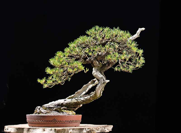
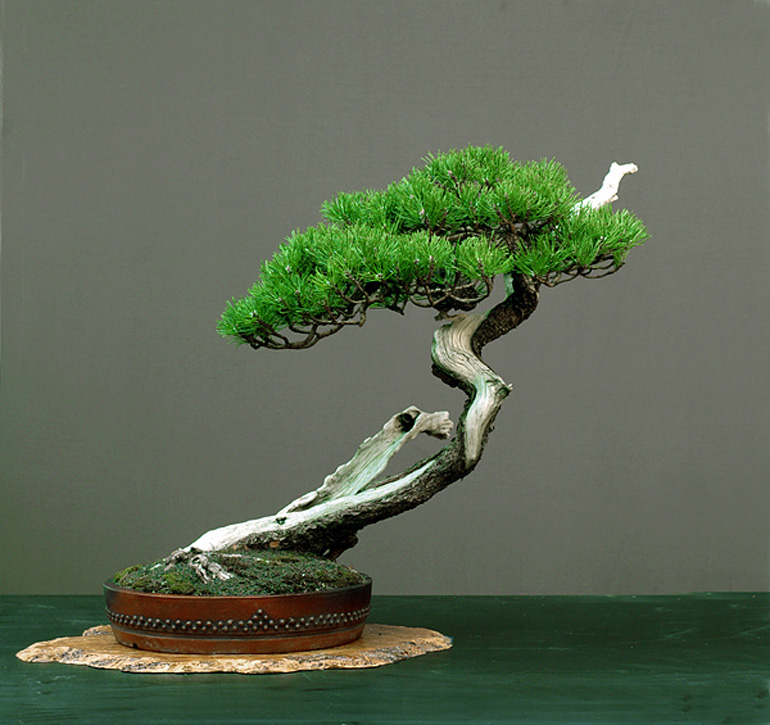
Background #1. This exceptional Mugo pine belongs to Walter Pall. The pot is by Peter Krebs. For more on this tree and others you can visit Walter's Bonsai Adventures blog.
If you’ve been following Bark for a while, you might have noticed that we have long advocated paying attention to the quality of the photos you present and that just shooting willy-nilly with little concern about background noise, lighting, space around the tree and so forth, diminishes the beauty of even the best bonsai.
Walter Pall grows and styles great bonsai and goes the extra distance when it come to photographing his bonsai. He is also the only bonsai artist I know of who routinely shoots his bonsai with two or more different backgrounds.
Ignoring for the moment that not all the photos were shot at the same stage of the tree’s development (and other differences), try to focus on just the background and let us know your preference. Feel free to elaborate (please don’t email me, rather put your remarks in the comments).
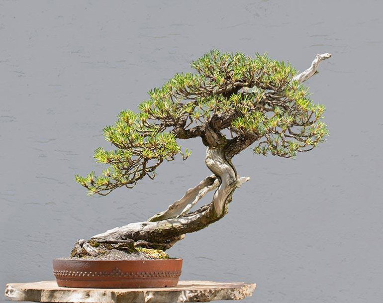
Background #2.
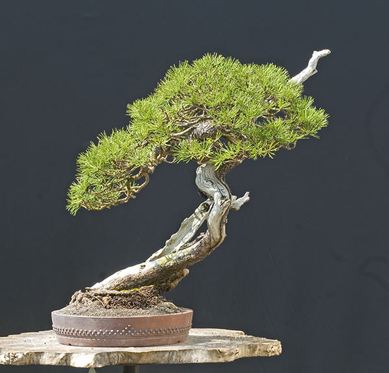
Background #3
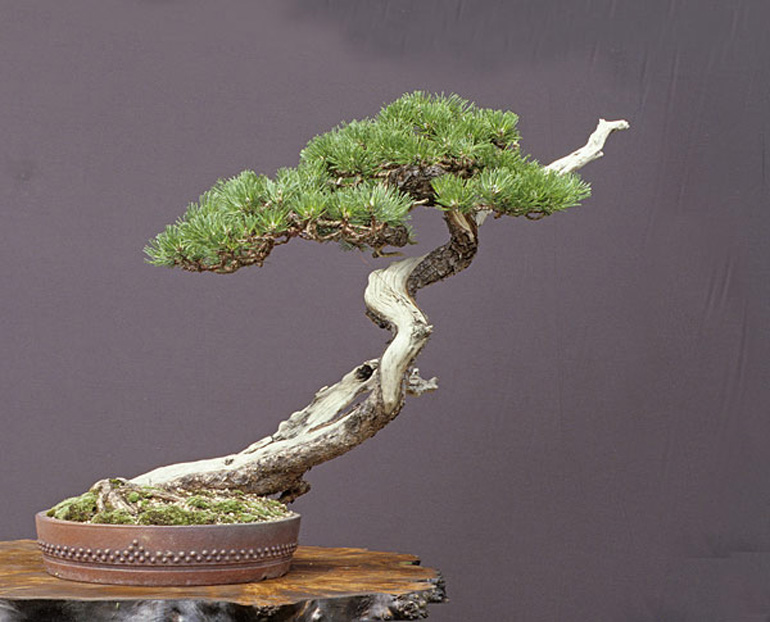
Background #4
Background #5
Our 25% off Bonsai Wire Sale
 ends Sunday night at 11:59pm EDT
 BTW, you'll get an extra 10% off
 for any Stone Lantern order of 100.00 or more
#3 or #5
#5
I too think #5 is the best, and would very much like to know what it is.
I prefer #1 or #3 because of the contrast as you can see all details of the bonsai.
are we really critiquing the backgrounds or the stage of the tree and the lighting? I like the darker charcoal one the best but the tree foliage is quite mature on the last one.
First off the best background depends on the tree, pot, stand and lighting. The background is chosen to highlight and element of the scene, the shari, jin, trunk, foliage, pot, etc. These 5 have been taken at different times, check the moss. And #1-4 are with seamless backgrounds where as #5 is a very distinct table top and a background. #5 is probably the most recent and the green enhances to lush foliage. In #1, 2 & 4 the tree and shari seem to get lost in the background, just making the tree very subtle. #5 with the enhances green, seems to make things artificial. So of these 5 pictures that leaves #3. Here the dead wood and shari as well as the foliage are brought out. But the pot is minimized and if there were moss it would be highlighted.
Interesting, thanks and could we do more?
Thanks Cheryl, Doug and every else so far.
I know the tree is at different stages and the lighting and some other features aren’t exactly the same in every photo, still, it’s the same tree and positioned more or less the same, so I thought it would be good enough to provide a little contemplation on bonsai photography and particularly background colors. And of course, it’s all for fun anyway.
#5…. although the exposure ,color saturation and the lighting seem very different. I too would like to know the color along with the manufacturer of the backdrop.
Number 1 all the way for me … lovely contrast and detail due to the crisp black background (and of course excellent lighting.)
Number 1 is best. As an ex photographic printer, the contrast is great, the colour accurate. It emphasises the hard edges of the tree and masculine and heavy pot. The others have some distractions. The green in no.5 has the line cutting through the design and the foliage looks a little plastic to me.
No. 2 is not bad either, it seems to have more depth but for this tree a plain background is preferable.
We have always used a cream background (plain wall) when photographing our own bonsai and last year a friend took a photo at night of one of our trees on his phone. The result was stunning! So now all our photos are taken with a black fabric background which I feel works best overall.
I like nr 1 and nr 2 which make the tree seem almost three diminutional. The others make it seem progressively more artificial – nr 5 could have plastic foliage
Oh, Wayne…for sure number 5- but, it’s the bottom color that works in a special way with that photo. The others don’t have that going for them. So, it’s a matter of not just the backround,but what’s under and possibly around and/or included in the picture.
My choice is number 1, the black background. I have been photographing bonsai for years and have determined that a black background is best for showing off the best in the tree. A black background is neutral which doesn’t detract from the tree or the container and it offers greater overall contrast to the tree which accentuates the tree, the color in the foliage and container, the detail in the tree, and the sharpness of the final image. The type of tree or the color of the pot doesn’t determine the background, a neutral black always produces the best result. In Japan they seem to prefer a white background or a vignette white to black background. When viewing these images you will notice that the images are flat or low in contrast, the color is not vibrant, the shadows are dark with little detail, and although the images have been sharpened the image doesn’t look that sharp. Much of this is caused by the white background because the camera exposure is based on the light reflecting off the white background and not the tree.
#3
It should be interesting that ALL dark backgrunds were the same in reality. It is simply a black shading cloth how one uses to shade the terrasse. The difference in color on the images come from the way the camera was set, the light (usually pure sunlight) and from photoshop. The whitish background is the white wall behind the cloth. With one and the same cloth I can make all these backgrounds for you at will.
Note how the densitiy of the crown changes dramatically from black to white backgond. The first two imafges had two minutes in between shooting them. The very same tree looks very dense with black and much more transparent with white background.
Thanks Walter,
That sheds some light on topic!
I hadn’t notice the difference in the density of the crown (in appearance that is), but sure enough, it’s obvious when you know what to look for.
Thanks Joe,
Your comments are very instructive and agreed, black is best.
BTW: I’ve always been impressed with your photos (U.S. National Bonsai Exhibition albums, Suthin’s bonsai and more), which have appeared here on bark numerous times. Here’s a good sample: https://bonsaibark.com/2014/12/30/bonsai-through-the-eyes-of-someone-who-possesses-the-patience-and-skill-to-take-photographs-worthy-of-the-subject/
For just “examining” the tree, #1 shows up the details the best, I think. But for an”art” shot — one to hang on the wall and enjoy — I think #5 would be the best.
I chose #5 because the green shading makes it look livelier and more pleasing to the eye.
#5 for me. I agree with what Doug B has to say – so to be blunt I can’t assess the value of the background without looking at the total effect of the presentation. I very much like the vibrancy of #5, but the reason the background seems so much more effective in that image for me, is because the foliage in that photo is more lush and I’d say distinctly more healthy, the pot is either changed or has been cleaned and oiled to bring up the rich red tones and detail of the rivet design, the elegant jita used for #5 is considerably more flattering to pot and tree than the slabs in the other photos, and the green undercloth which might seem to much color elsewhere – well here it balances out the foliage and other color .