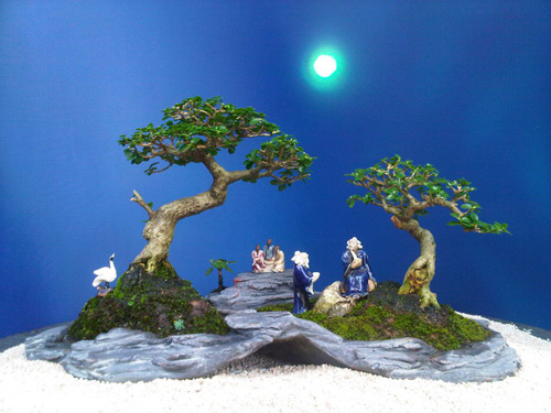
 This planting (River in India
 by Lew Buller) was the subject of a critique contest that we posted back on September 2nd.
Note from the present (March 19, 2014): This planting is NOT by Lew Buller. It is from his book Saikei and Art, but isn’t his. My apologies to Lew.
Plenty to choose from
Thanks to all of you that bothered to send a critique. We got plenty of good ones and just as I expected, they ranged all the way from very positive to critical. We even got one from Robert Steven (see below), author of Vision of My Soul and Mission of Transformation, who has since contributed several high quality critiques of our reader’s trees.
The winner is… but first a comment from our sponsor
The winner turns out to have a critical eye, and, as you might expect, more or less reflects my view. Not that I don’t appreciate what Lew was trying to do with this planting or the charm that he did manage to convey. It’s just that overall, I think he defeated his purpose, primarily by using too many elements, not all of which go well together. I do however, like the trees (though I could take issue with how the one on the left is planted).
My apologies for picking on Lew Buller. Mostly I like what he does, so much in fact that I used to publish articles by Lew in Bonsai Today and have promoted (and currently sell) his unique and noteworthy book, Saikei and Art.
The winner (it’s too long, but so well thought out, I just couldn’t refuse)
The winner is Sue Marsh. Here’s her critique (including all her returns):
“My first thought when I saw this picture was…blah.
The scene is too sterile and artificial for my tastes and there are
some elements that do not match each other. When I look at a
bonsai landscape (penjing) I think it should either look natural
or completely whimsical. This landscape should be a “natural”
one but it does not work for me.
For instance, the slab is too sterile-there is moss “grass” all
over the base of the trees, but no moss “grass” in any of the
cracks in the slab. Every cliff is going to have some vegitation
clinging to is.
The little tropical palm tree looking plant towards the back of the scene
does not fit with the old gnarled forest trees making up the
rest of the scene. It distracts from the composition.
Having the seated figures in the back almost perfectly centered
also bothers my asthetics. I see the effect of the path leading
from them to the foreground, but maybe moving them over to the right
of the flat area and shifting the position of the standing man
in blue so he doesn’t cover them would help.
The main trees are placed too evenly for my tastes and the mounds
they are on don’t work for me. Placement wise, I would like to see
the small tree on a flatter topped mound. The larger tree I would
like to see on a less severe pyramid-the slab has flat rounded
lumps so the sharp angles of the mound conflict.
As to the tree styling themselves, I would either carve out that
lump and eliminate the branch on the left side of the big tree, or
I would figure out a way to encourage some spreading roots out of
the base. If a tree had that small of a base on that severe of
a peak and a big wind came by, it’d blow off.
For the small tree, I would carve down the lump that’s on the
lower left side of the crown, it detracts from the top of the tree.
In conclusion, I dislike the lack of moss on the slab, the
palm tree looking accent plant, the placement of the back
figures, the shape of the tree’s mounds, the lack of supporting
roots on the large tree give the shape of the trunk, and
the lump under the crown of the small
tree. I like the bird and the other two mudmen… This planting
has potential but it needs more realism in my opinion.
Robert Steven’s critique
– Trees suppose to be the main object in such creation and should be the
focal point; but in this creation, the focal point is not clear, the trees
are in competition with the figurines.
– The front figurines and the rear figurines are two different product
characters, this decrease the unity.
– The bird figurine on the left is too big and does not follow the
“proportion” concept.
– The two trees are placed in a too symmetrical manner which look separating
apart and boring, no “bridging element”, lack of integration.
Well for me, let’s give credit to the bonsai artist who created ( Better Late Than Never ) replica of bonsai sorrounding! As bonsai enthusiast, I appreciated this work of art, though, this might be fall short of recognition to the eyes of the expert (i’m just a bonsai lover ( fond to be called ) rather than a bonsai expert. Take note guys, basics and other foundations of bonsai can be learned and given away but artistry and interpretations lie on the bonsai lovers; like us. Bonsai beauty transgressed no boundaries but every nation has its own taste and showmanship on bonsai based on its culture, traditions, beliefs and influences worldwide. The bonsai above for me created a stirring ” yeses and noses”, but it created self – artistry on the “commentors” that will reflect his. her personal views. I challenged everyone to try proactively your bonsai personality defying the norms and classroom – type bonsai teaching. At the end the bottomline, the bonsai that catches one’s attention wins from eyes to within – heart.!
Bonsai Bantigue,
Thank you for your observations. It’s always to good hear from people who might not share our critical views.