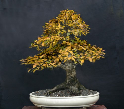
Robert Steven’s simulation of a Manchurian pear that was submitted by John. His original submission is below.
Fall color bonus
A while back we ran a few posts on fall color. This one qualifies for that group as well as a subject for a critique. In fact, it was the tree’s fall color that prompted John to send it to us. Now with John’s good-natured permission, Robert gets a crack at it.
Autumn in March
John lives in Australia (but far from the flooding). So this photo was taken while late winter snow was still on the ground here in Vermont. Robert Steven lives in Indonesia, where fall color and snow have little meaning.

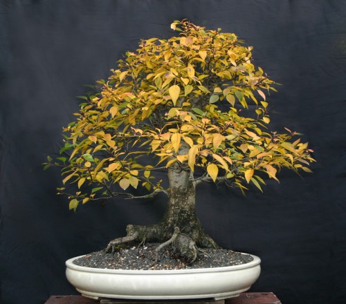
John’s original.
Robert’s critique
The best feature this tree displays is the leaf color. Other than that, there are many points to comment on.
1. In bonsai design, I always emphasize the importance of horticultural clues (plant physiology and morphology) in order to make a bonsai look natural; the way a mature tree grows in nature.
Let’s start with root formation. Specifically, the dominant main root growing to the left. In nature, this condition will not form a symmetrical tree because the foliage will tend to follow the direction of the main root.
The artist has correctly place the tree slightly to the right in the pot, but the top is too symmetrical and doesn’t show the movement to the left that you would expect. This symmetry causes the tree’s overall feel to be less interesting than it could be.
2. There is an obvious cut on the main root which does not look natural. And there are many other messy roots.
3. This bonsai does not reflect a mature tree in nature. Another point I always emphasize in bonsai design, especially on deciduous trees, is ramification (branching). Only ideal ramification can make a bonsai looks like a mature tree.
All the branches are too small compared to the trunk size. Branch placement is also an issue, as is the fact that much of the branch structure is hidden by the full foliage, which has an unrefined, somewhat messy look.
4. The foliage pads are not properly refined and the leaves are too big, which is one reason the overall look is a little messy. It is not easy too correct these mistake without cutting off all the branches and starting over. Because the existing branches have been pruned, they will grow older, but not much thicker. This is why the initial stage in bonsai design is so important if you want a good bonsai.
Ideally, there should be at least one dominant branch on the left side to follow the dominant root that grows to the left (as is shown in the simulated picture).
If you don’t want to re-grow the branching, I suggest that at least the following steps can be done to improve the design :
- Improve the cut on the dominant root so it looks natural and clean up the messy roots.
- Reposition the trunk by leaning it slightly to the left to create more logical movement.
- Reform the foliage pads by shortening the right side and create more space between the pads. Refine the contour on the foliage surface and foliage edges.
These steps should be done as part of an effort to improve the ramification of any deciduous tree.
The new foliage pad formation (in the simulation) helps create a natural and mature look. The refined foliage edges reduce the visual size of the leaves and improve the tree’s overall composition.
General comments
There is more than one way to design any bonsai and my critiques and recommended solutions might not always fit your taste because of personal preferences. But I always try to give my opinion based on artistic and horticultural principles.
To understand my concepts better, please read my books Vision of My Soul and Mission of Transformation which are available at Stone Lantern.
You can also visit my bonsai blog.
Robert -You have such an amazing sense of artistic horticultural knowledge that I think you should open a school. I appreciate your critiques as they enable me to see things in a different light. I learn,and thats a good thing.
Thanks Steven…Happy New Year !