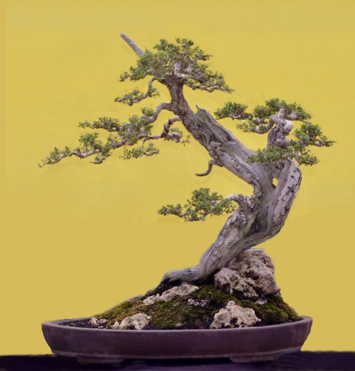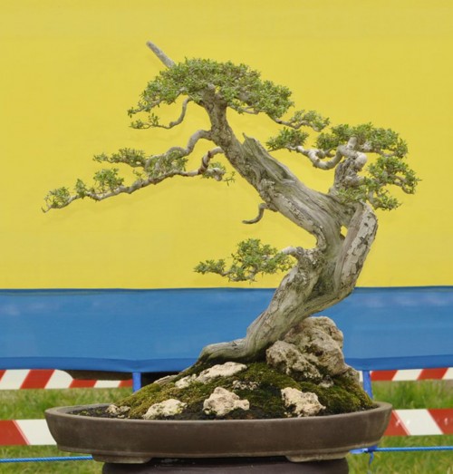
Robert Steven’s simulation of a Pemphis acidula that was submitted (below) by Surmardi of Indonesia.
Making our point
Though Robert doesn’t mention it in his critique, he does remove the background clutter that you see in Surmardi’s photo. To my eye, this change has as much impact on the tree’s appearance as Robert’s other changes. Preparing and photographing trees is a topic that we have discussed in this blog; most recently, in our last post.

Surmardi’s original begs the question: why not just raise the tree and photograph it with only the yellow background? The failure to do something that simple is a perfect example of how to diminish an otherwise very worthy bonsai.
Robert’s critique
This is a good example of bonsai that portrays a tree that has been shaped by natural forces. Although the trunk has a reverse-taper, it does not bother the eye. To the contrary, it becomes a unique point of interest, especially given that the artist is smart enough to place a large rock in a way that compensates and creates visual balance.
The small jin at the top does a good job of playing the accentuation role, and the selection of the pot is just perfect in creating a natural feel.
My only real concern is the shape of the crown. It is too round and dense compared to the foliage on the rest of the tree, which is more irregular and sparse. This inconsistency impacts the overall balance and character of the tree.
My suggestion is to make the crown irregular, and then refine the other foliage pads.
You can also change the right branch so that it slightly overlaps the trunk. This adds depth to the foreground.
The the arrangement of the rocks looks slightly unnatural; they are more or less the same size and placed too symmetrically, with somewhat even spacing. This can be improved as shown in the simulation.
General comments
There is more than one way to design any bonsai and my critiques and recommended solutions might not always fit your taste because of personal preferences. But I always try to give my opinion based on artistic and horticultural principles.
To understand my concepts better, please read my books Vision of My Soul and Mission of Transformation which are available at Stone Lantern.
You can also visit my bonsai blog.
I disagree this time with Robert’s assertion that, “The small jin at the top does a good job of playing the accentuation role.”
I find the jin at the apex is rather uninteresting and unnecessary, like the horn or a unicorn. I believe the bonsai would improve with its removal.
Otherwise, I like Robert’s ideas and the bonsai itself. I wouldn’t mind having it and its problems for myself!
This time, I agree Alan Walker: that jin is too straight, has not point. and about the foliage, I´d like to see more density on the secondary branches. Show us on Spring!!
I have to agree with Alan Walker. I too find the jin artificial. It looks too much to be the former apex which reveals that the trees positioning in the pot was changed. It doesn’t look natural to me, too much like a unicorn horn, stuck on a horse. Otherwise, all the other critiques are right on the mark.
Thanks Alan, Al and Mariël,
It’s unusual to see people taking issue with Robert. Three people no less.
I’m not sure it makes any difference, but just in case, here’s the phrase in question in Robert’s own words (I’m his native speaker English language editor for his posts, per his request): “The small jin on the top is playing a good role of accentuation.”
Thanks Alan and Mariel (I don’t see the comment of Al).
As I always mention on my every critique, my idea is not always the best because there is always personal preference..and your thought might be right as well.
The reason I prefer to keep it is, in fact related to my basic thought of this bonsai. My first original sentense was ” This is a good example of bonsai design which portray a transformed tree in nature.” instead of “This is a good example of bonsai that portrays a tree that has been shaped by natural forces.” These two sentenses are different in basic thought (Wayne, I’d suggest you to send me your idited text for my approval before posting to avoid mis-intepretation..sorry..hehe…).
I want to emphasize the “transformation” concept (please read my book “Mission of Transformation”) and I consider the small jin would emphasize the transformation..as Mariel says “It looks too much to be the former apex which reveals that the trees positioning in the pot was changed”….
However, it’s easier to take off the jin rather than saying “if there were a small jin…”…
Once again, thanks guys !
Wow, you must have heard my opinion even though I hadn’t typed it yet!
I agree about the jins, insofar as the apical jin does not retain the texture of the tree’s shari. I would take a page from the Dan Robinson school of design and carve that jin up to tell a story, or remove it. First choice would be to remove it though; I find it distracting. And I love Robert Steven’s trees. :-)
Sorry,
I didn’t notice that Al’s wasn’t showing. Now you can see it.
That was a different Al though! The Als concur.
Yeah. That’s why the other Al didn’t show up (first timers have to be approved, otherwise the whole show would be buried in 10,000 feet of spam). I thought him was you.
Sorry I’m late to the party. But, I concur. Before reading the comments
I merely had the image of the tree (both the simulation & the original). The first thing that came to mind was the “pointing” of the shari. What was it pointing at? It’s almost like when someone spontaneously looks up and stares. You’re almost forced to focus on a pointless point.
Sumardi..seems that everyone agree to take the jin out…
Sorry I know I am way too late in looking at this simulation. But the comments arrested my attention.
Have you noticed that the bonsai is going two diffetent ways…. first to the right and then midway the change of direction to the left? In my opinion, it is the top jin which is giving the bonsai its eventual direction and therefore, as Robert says, it plays the role of accentuation – that of giving the tree its direction without which the tree would look lost as to which way it is flowing….. Just my opinion guys……..
Thanks Rajeev,
Makes sense to me.
While I agree that the point of the shari could be carved a little so as to not appear quite so blunt, who doesn’t like a unicorn or a medieval knight on a charging horse… this is what bonsai is all about, isn’t it? To stimulate one’s imagination?