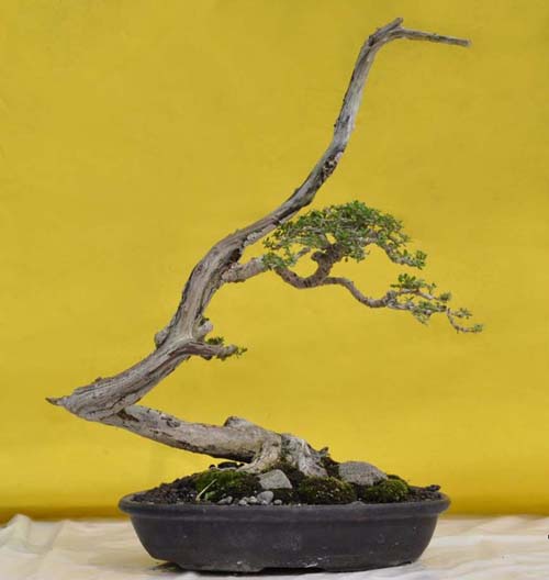
Simulation by Robert Steven. The original, which was submitted by Ihwanuddin Lutfi is below.
Send us yours for a free critique
For a while we were getting regular submission, but now, the well seems to be a little drier. Don’t be shy. Robert can be very direct, but then, how many people have the expertise and confidence to be so direct? And so helpful in viewing your bonsai in a new light? You can send your photos to me, or directly to Robert.

Ihwanuddin Lutfi’s original. Notice how Robert softened the background color in his simulation (above).
Robert’s critique
Pemphis acidula is an iconic bonsai in Indonesia. This bonsai is very simple, yet presents interesting material for a critique.
The focal point of this bonsai is the unique trunk line. The artist obviously realizes this, but the overall composition needs to be improved in order to emphasize the focal point in better unity and create an overall sense of harmony.
The three main design elements: the trunk, the foliage and the pot, seem to be separated. The main object (the tree) is biased by the over-size pot. This is made even worse by the dark color of the pot, which creates extra visual weight and dominates the tree.
The composition can be improved by:
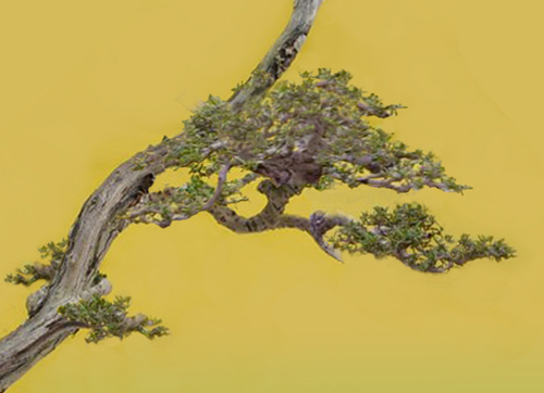
-Developing a bigger crown, which overlaps the trunk, and covering a little bit of the “neck” in order to create unity.
-Using a smaller round pot with a lighter color that doesn’t overwhelm the tree.
-Letting some leaves grow on the small lower branch and in the back to create accentuation, fill the wide-open space and to create depth.
-Carving the blunt cut of the jin at the top in order to create a more natural look.
The improved design in the simulation below shows a charming bonsai…however, yellow is not an ideal background color for bonsai.
General comments
There is more than one way to design any bonsai and my critiques and recommended solutions might not always fit your taste because of personal preferences. But I always try to give my opinion based on artistic and horticultural principles.
To understand my concepts better, please read my books Vision of My Soul and Mission of Transformation which are available at Stone Lantern.
You can also visit my bonsai blog.

Cose-up of Robert’s simulation.
My two cents
The background in Robert’s simulation is not a bright as the original. Based on Robert’s comment that “yellow is not an ideal background color for bonsai,” I imagine that the change is intentional. Unfortunately, making the background less bright also makes the tree a little duller. I played around with photoshop in an effort to brightened the tree without doing the same to the background, but my photoshop skills weren’t up to the job.
I have long considered Robert Steven to be one of the most daring and innovative bonsai artists anywhere. His tireless energy and enthusiasm and his understanding and respect for tradition combined with his willingness to break with convention, have done much to promote and move the art of bonsai forward.
Having now put things in perspective, I do have a small question about the rocks. The rock to the right blends in quite well, but I’m not sure why Robert left the two small rocks in front of the tree. Given the small size of the pot and the details in the nebari, they seem to distract more than enhance.
Thank you for critique & your opinion Mr. Robert.
I really2 apreciate that.
Best Bonsai Wishes…..!!!!
Salam Bonsai dari Indonesia…!!!
This tree is asking to be seen as actively balanced (as compared to passively). I would remove all the rocky pieces and simply position the tree further to the right. The edge of the container will serve as the balance on that side. You then create more movement to the left, from where balancing (by movement) is created towards the right. Thus balance to one side at the bottom and at the top. I agree that the dead wood above the highest foliage canopy is uninteresting, though it simply needs some detailed carving.
What a delightful tree to work with and look at!