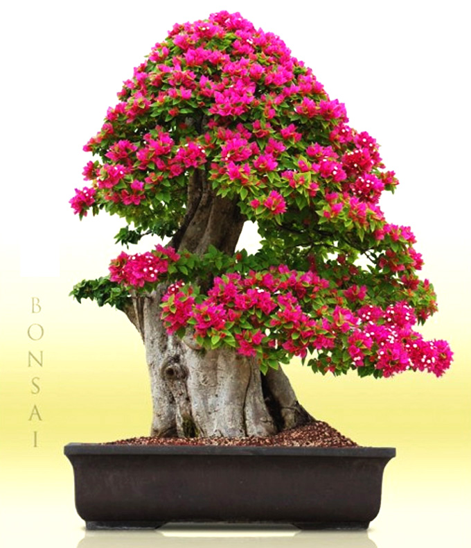
 Bougainvillea, Wigert’s Bonsai. I originally captured this impressive monster on facebook. I took the liberty of photoshopping to soften the background a bit. In the process, the flowers brightened some (a result of limited photoshop skills, no doubt). Still, even without my help, this tree exhibits a striking combination of power and color. You can visit Wigert’s Bonsai Gallery to see another shot in a different setting.
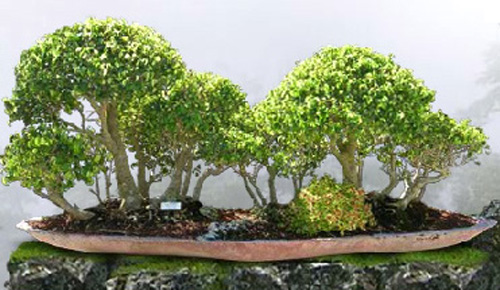
 Too Little Ficus Forest. This one was lifted straight from Wigert’s Gallery. It’s cropped a little tight to eliminate some background text, but even so, its balance and beauty are obvious. I like the choice of trees, the arrangement, the sense of depth, and almost everything else about this planting (it would have been better to remove the distracting white tag), including the remarkable pot with its coral/pink blush.
The Too Little forest planting, though very charming and seemingly well cared for, seems to me to be too evenly divided. There is no real dominance and the trees are leaning away from each other.
Maggie
Thanks Maggie,
I just took another look and I agree that the two groupings are a little too evenly divided and therefore a little static. Still, the grouping on the left does seem dominant, so I don’t see a big problem there.
Trees at the edge of stands often lean out for light, so I think that part makes the planting look natural.