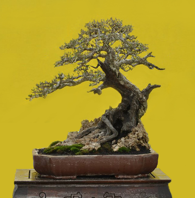
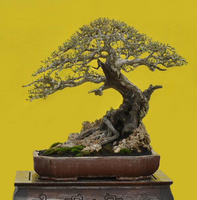
 After. Robert Steven’s simulation of Pemphis that was submitted by Soni. The before photo is below.
Before you read any further…
…take a look at the two photos and see if you can spot what’s different.
 Soni’s original. Not too much to improve, though I think it would look better if the residue on the pot was removed.
In Robert’s own words
All the features of this tree look perfect, but overall it does not look very natural due to the neatly shaped round canopy.
There are two main factors that make a bonsai look natural: the ramification (branch structure) and the canopy shape. The better the ramification structure you can show on a bonsai, the more natural it will look. If you shape the canopy in more irregular form with sufficient spaces here and there, the bonsai will also look more natural.
That’s why when you look at a bonsai with a canopy that is too refined, without some open spaces, it will look artificial; too decorative rather than portraying a big tree in nature. The reason is, if you look at a tree in nature, no matter how dense the foliage is, there is always contour on the foliage surface with spaces here and there. Only a tree seen from a very long distance does not show the detailed contour, but shows only the silhouette instead. So, if you combine an illusion of long distance when it comes to the foliage, with other physical features which show close up details (the trunk with the bark for example), it doesn’t match and our sub-conscious rejects it. It simply isn’t perceived as a natural tree.
But, this doesn’t mean that you should exactly copy the way a tree looks like in nature with messy, sloppy and unrefined foliage to suggest a natural look. This has no value for bonsai as an art form. Instead, what you need is to refine is the foliage edges and ramification structure, and to create sufficient contour and spaces, avoiding foliage that is too neat and without contour.
The simulated picture (at the top) shows how changing the foliage by adding spaces give a much more natural look.
General comments
There is more than one way to design any bonsai and my critiques and recommended solutions might not always fit your taste and personal preferences, but I always try to give my opinion based on artistic and horticultural principles.
To understand my concepts better, please read my books Vision of My Soul and Mission of Transformation which are available at Stone Lantern.
You can also visit my bonsai blog.
And one other comment.
It would be great if in a few years there is a opportunity to re-visit the original post with an updated photo of the trees that are critiqued. Kind of a before and later kind of thing.
I suppose “after” never gets here in a bonsai tree.
very much agreed with mr steven…the upper on the first pic seems better, but maybe even better would be to slash the other of the apex , the one on my left so that a more apex is shown, thus a more Huang Shan look …isn’t it so…
First picture looks natural. A beautiful tree from an ordinary Pemphis material. Thanks for sharing. Love to see more!
Louie, I don’t really catch your point of which part of apex to be slashed..and what do you mean by to show more apex ? If you mean to shape a more apical crown shape, then I would not agree because deciduous tree is not apical dominant like conifers..
You mention a more Huang Shan look..NO ! NO ! NO ! Huang Shan only grow pine, and you SHOULD NEVER shape your deciduous bonsai to resemble conipers !!!
This in one of the basic problem all over the world, they shape all their bonsai in conifers shape. Deciduous trees and conifers have different physiological structure, either on the basic overall shape of the ramification structure, that’s the reason why many deciduous bonsai do not look natural…even worse when they try to twist their branches here and there and adding jin-shari to copy junipers… This is my very first tips every time I give lecture…