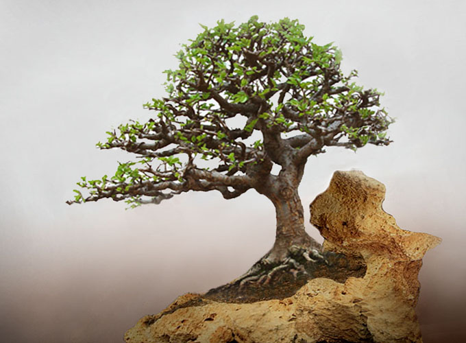
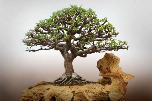
 Robert Steven’s simulation of a Chinese elm root-on-rock bonsai submitted by Ikhsan. The original (before) photo is below.
Still impressed
No matter how much I try, I don’t see nearly as much as Robert Steven sees when he does his critiques (it’s not even close). So, once again, I am left to sing the praises of Robert’s bonsai wisdom. If you’d like proof of that wisdom, just read on. Or, you can check out Robert’s books and search his name on this blog and read through dozens of his earlier posts. It’s time well spent.
Robert’s critique
How can two nice components create a less-than-beautiful design?
We can all agree that this bonsai and the natural container are very nice (see photo below), but we still feel there is something wrong in the overall composition, which make the design less beautiful than it could be. How can two nice components (container and tree) create a less-than-beautiful design?
It’s about our cognitive sense and our sub-conscious. Our background, experiences, culture, education, social value; what we see and what we learn, all are stored somewhere in our brain. Then, when we see something that doesn’t accord with the data in our brain’s folder, our cognitive sense rejects it and our sub-conscious reacts to the discrepancies and perceives it as less than beautiful.
 Here’s the original photo that Ikhsan submitted.
So, what’s wrong with this bonsai?
The problems have to do with natural phenomena, the plant’s physiology and morphology, which have not been logically applied in the creation of this bonsai.
– The tree grows in relatively symmetrical manner with slight movement to the right and with the roots spread equally around the base of the trunk.
– The natural container depicts a generally rocky area with the tree growing beside a big rock on its right.
– Logically, in such growing conditions, the tree’s roots system will not spread equally around, but tend to grow to the left for the water source, and grow away from the barrier on the right. Physiologically, the tree will never grow symmetrically or with movement to the right when the roots in the ground are growing to the left
– These are the reasons we feel the design is not as beautiful as it could be, even though the two main elements are nice.
Correcting the flaws
So, to correct it, simply follow the plant physiology and plant morphology. In most case, this just means that you can use common sense when it comes to natural phenomenon. This is the element we sometime overlook in our bonsai design process.
- I would correct the shape of the container by cutting it to make it shorter and to create a downward slope. The objective is to create more natural look that fits the shape of the tree.
- Reposition the tree to lean to the left, cut some of the roots on the right, so that they are slightly one-sided to the left.
- Shorten the right branches and lengthen the left branches to create movement to the left that follows the direction of the roots.
Now, when you look at the simulated image, you see a better composition with more a logical design: a tree growing on a sloping rocky area. When it’s more logical, you feel it’s more beautiful…
General comments
There is more than one way to design any bonsai and my critiques and recommended solutions might not always fit your taste and personal preferences, but I always try to give my opinion based on artistic and horticultural principles.
To understand my concepts better, please read my books Vision of My Soul and Mission of Transformation which are available at Stone Lantern.
I’m not sure I like the simulation any better. The tree doesn’t look like it grew there. It looks like a tree that grew on level ground and has just been tipped or tilted. It seems more forced than the original. The simulation also has the feel that something is wrong. It has a kind of tension but not in a good way. The tree looks like it’s going to fall over at any moment.
Thanks John,
I see what you mean, though I wouldn’t say the tree is the problem, but more that the whole planting looks a little unstable with its tilt to the left and that a very slight adjustment would solve that problem. Maybe Robert has something to say about this. Or, someone else?
I believe the point Robert is trying to make in the redesign is that trees in nature do not grow in a perfect trimmed look or follow the bonsai design rules. All to often we force those rules on our tress regardless of the species or look of the tree. So many times at meetings and workshops I hear people ask the instructor “Can I jin that?” and the tree they are working on will be a tropical or succulent. Look at all those pines growing high in the mountains clinging for life on a rock ledge, do they look off balance? I would be tense if I was hanging there but the tree is in perfect harmony with it’s surroundings. Robert said it perfectly in his general comments “There is more than one way to design a bonsai….” In my humble opinion I vote for the way nature does it.
The reworked photo looks much more natural to me. I do not sense an unbalance in the change, just the result of growing conditions. Water and soil mass to the left and perhaps a bit of wind from the right. The rootage looks better and natural in the changed photo instead of being perched on top of the surface.
I think that Robert philosophically is right on this tree. He can only work with what he is given. The fact that the tree and its “container” don’t really go together is not his fault. In nature I don’t think you would find a tree growing so vigorously under such extreme conditions as a windy hillside. Hillsides produce convection currents that essentially deform the growth of trees and inevitably produce rigorous conditions that would result in distortion in the roots, trunk and branches of a tree. I also think some dead wood and scarring of the trunk would also occur.
Thanks for your comments, guys…
What I am trying to say is that this bonsai and the container are both perfectly done, but they don’t fit to be put together, because then the whole design does not follow the plant phisiology and morphology as described, then it looks less beautiful. In another word, the artist forces to use his nice container to this nice bonsai as obsession instead of considering the whole aesthetic.
The reason why I still use the same container in my simulation is that, if the artist still want to use it, he need to correct the container and the tree shape so they can fit better and more logical as explained (sorry John, I don’t see the unbalance, maybe you can specify).
To be frank, although the container is nicely done, but I DON’T like it to be used for this bonsai. WITHOUT CHANGING ANYTHING ON THE BONSAI, BUT SIMPLY CHANGE THE CONTAINER TO A NORMAL RECTANGLE CERAMIC POT..IT’S JUST A PERFECT BONSAI !
This also tell that selecting a proper container for a bonsai is such important….
Best regards from Sao Paolo airport….