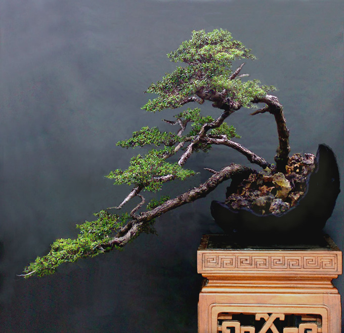
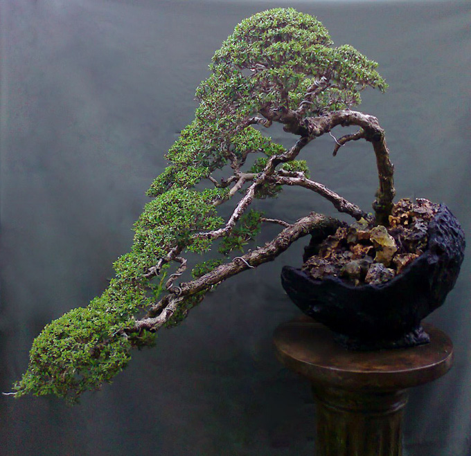
 Robert Steven’s simulation of a Pemphis acidula that was submitted for critique by Hamman Harris. The original is below.
Bow and arrow
Once you get beyond the fact that the bark and shape and even the foliage (at a glance) on this Pemphis look so much like the common Juniper pro-nana (that made-yesterday little bonsai imposter that flooded our Holiday malls last century), you might notice that there’s an unmistakable bow and arrow effect going on here. True, the bow has been softened considerably by Robert in his simulation, but the arrow remains. Perhaps Robert left it the way it is because it’s the feature that makes this otherwise unremarkable tree unique.
Robert’s critique
This is bonsai presents a good opportunity to talk about visual balance
Visual balance in art is not the kind of balance you get by weighing something with a scale. It’s more a visual illusion you sense from a composition (continued below).
 The original as submitted by Hamman Harris.
In the case of this bonsai, you get the sense that it’s falling down to the left. In other words, it lacks visual balance.
– The container with its round bottom, along with the shape of the pedestal, create a very unstable appearance, rather than a solid well anchored feeling.
– The bow shaped right trunk forcefully drives the weight down and to the left.
– The unbroken flow of foliage without any gaps, creates a very strong directing line that further transfers the visual weight to the left.
– The crown is too big and the foliage pad is too dense.
– As mentioned above, there is a lack of empty space (gaps) between the foliage pads.
Solution
– Flatten the bottom of the container and use a rectangular pedestal. Both of these changes contribute to a more stable feeling.
– Refine the foliage by making it more irregular, creating more gaps and opening up the crown. Turning some branches into jin will also help to decrease the illusion of too much weight.
– Partially cover the bow shaped trunk on the right with some foliage. This will help to decrease the illusion of the too much force down and to the left.
By following these steps, the overall composition is improved and a better visual balance has been created.
General comments
There is more than one way to design any bonsai and my critiques and recommended solutions might not always fit your taste and personal preferences, but I always try to give my opinion based on artistic and horticultural principles.
To understand my concepts better, please read my books Vision of My Soul and Mission of Transformation which are available at Stone Lantern.