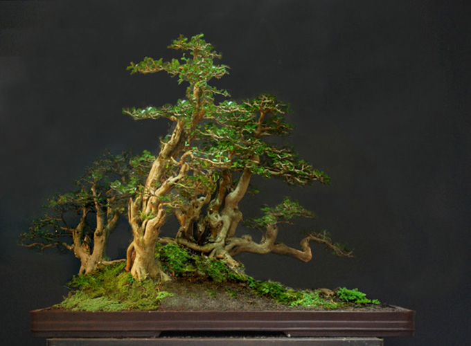
 Simulation number two by Robert Steven. Simulation number one is below. (Our reasons for putting the second one first is NOT to confuse you; it’s just that we like it more).
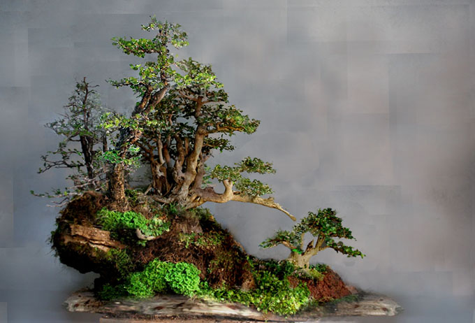 Simulation number one by Robert Steven.
A first
This is the first time Robert Steven has presented us with a two part critique. It’s also the first time we’ve offered a 3D image. Rather than confuse the issue any further than we already have (see above), we’ll just go straight to what Robert has to say.
Robert’s two part Jun Ilaga citique in his own words
These two pictures of a Muraya bonsai planting belong to Jun Ilaga from the Phillipines. The first photo shows his initial design. Then, because he wanted a more unique design, he decided to restyle it. The result is shown in the second photo.
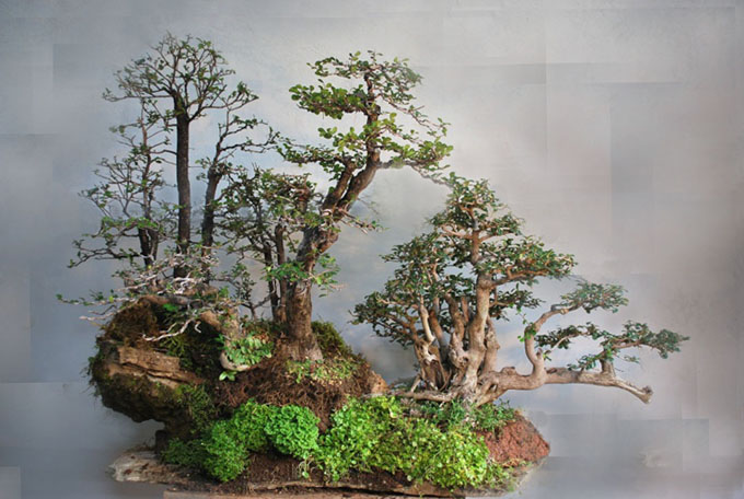 First photo (submitted by Jun Ilaga).
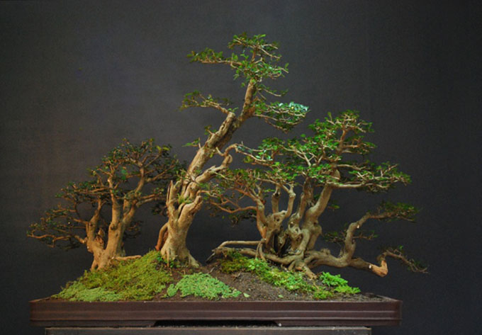 Second photo (also submitted by Jun Ilaga).
Robert’s remarks continued…
The artist wanted to create a unique design. I think the first design idea is better than the new design, especially because of the hilly contour.
For me, the unique part is the clump that he put on the right side, with its branch stretching out to the right. I want to use this branch as our talking point; a point of interest that depicts a natural logic. The hilly contour is also a very interesting creative component.
In my opinion, the way he put the main clump on the right (low part) has biased the focal point of the overall composition. In forest or grouping style bonsai, the focal point is suppose to be positioned a little off-center, then the viewing should flow from that heavier focus to the lighter areas of the planting.
In the initial composition, the focal point is not very clear either; there is kind of competition between the two groups. They look separated as though they don’t belong to the same planting. As a result, there is a lack of unity.
As you can see in my first simulation (second photo at the top of post), I moved the main clump onto the hill and combined it with one of the tall single trees to create an integrated focal point. Another purpose is to emphasize the talking point, the branch that stretches out over the hill side. I think this idea really emphasizes the planting’s uniqueness.
In order to create a better sense of perspective, I use a slightly bigger slab that provides more space on the right and the front. Then we can contour the slope on the right side to the back, allowing it to be overlapped by the larger hill. This creates a gap than provides perspective.
Empty space is very important in creating a feeling of perspective. You can see this where I use a small tree on the right side of the planting. This small size creates the illusion that the tree is back in the distance.
In my second simulation (photo at the top of post), my comments would be much the same in relation to the focal point and viewing flow. As you can see, more attention has been paid to the planting’s sense of unity with the “asymmetrical balance” concept.
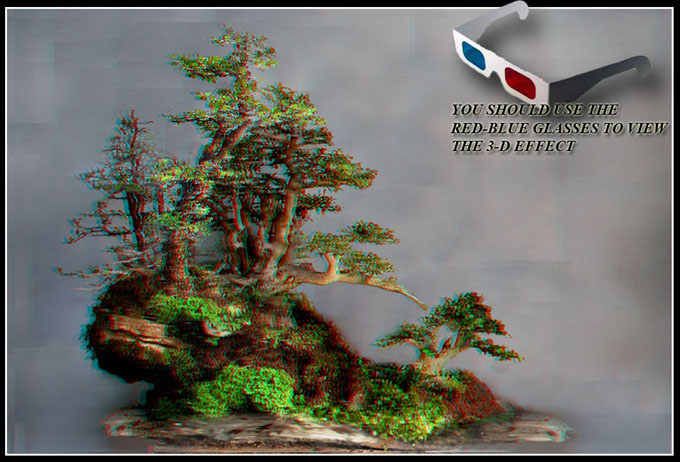
Just for fun, if you have a red-cyan 3D glasses, you can view the below picture in 3D image.
General comments
There is more than one way to design any bonsai and my critiques and recommended solutions might not always fit your taste and personal preferences, but I always try to give my opinion based on artistic and horticultural principles.
To understand my concepts better, please read my books Vision of My Soul and Mission of Transformation which are available at Stone Lantern.
My new bonsai blog address : http://robert-steven.ofbonsai.org
