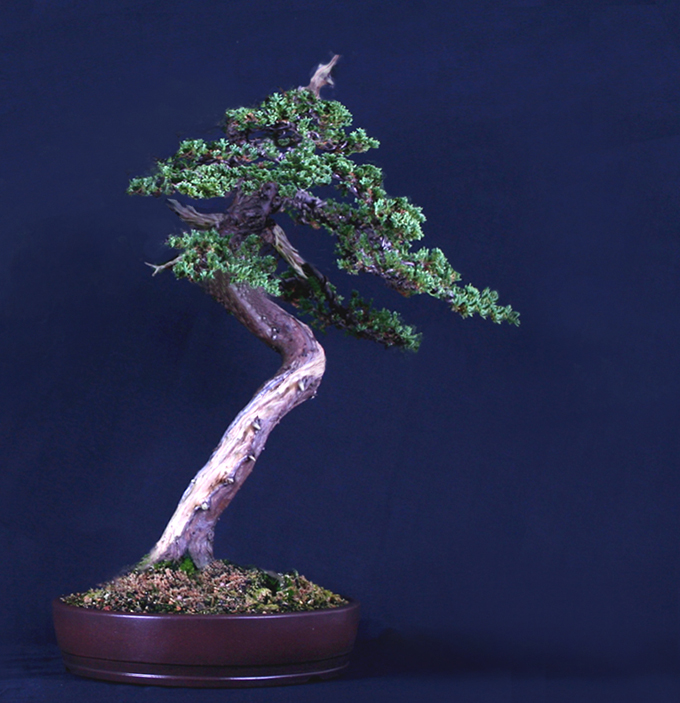
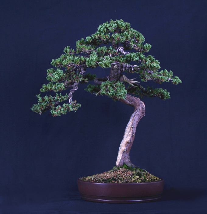
 Robert Steven’s simulation of a juniper submitted by Peter Woosley. Peter’s original is below.
Last post we borrowed from our archives and featured the artistry of Robert Steven. Might as well follow up with more archival Robert (from April, 2011).
Before we start, a quick heads up with a nod to our sponsor (while staying on topic): We are down to less than 200 copies of our Masters Series Juniper bonsai book, and, as it turns out, we are currently running a 25% off sale on all of our books. Enough said.
A surprising shift
Robert fooled me (once again). At a glance I thought the tree had potential more or less as it was. All it needed was perhaps a little lean to the right, some work on the crown and that heavy upper section of trunk (where the first branches come off), and especially on the somewhat stiff feeling branch on the lower left that caused the whole tree to seem unbalanced. However, Robert saw things differently and ended up with a much more interesting outcome (though I would still like to see that thick upper section of trunk hidden or reduced a bit).
Robert Steven’s critique
This tree looks young and there is also a visual balance issue. The canopy is too big which gives an overweight feeling to the top of the tree. Also, the side branch on the left that points downward disturbs the visual flow. Overall, the tree seems unbalanced and the form of the round canopy does not fit to the character of the trunk line.
I would suggest a total restyling. The main objective is to explore the character of the tree based on the dynamic trunk line. In order to emphasize this dynamic flow, I would change the tree’s movement from the left to the right, by repositioning the the tree in the pot and leaning the trunk slightly to the right. I would also shorten all the branches on the left side, and extend the flow to the right.
In order to make the tree look older, I would shorten the crown and turn the apex into small jin, and reform the foliage to an irregular form that fits the character of the casual trunk line.
Last but not least, I would continue the shari to the right (I see a cut there), then continue from the back to the branch on the left. By doing so, the trunk movement is improved and the tree looks older with more charm.
General comments
There is more than one way to design any bonsai and my critiques and recommended solutions might not always fit your taste and personal preferences, but I always try to give my opinion based on artistic and horticultural principles.
To understand my concepts better, please read my books Vision of My Soul (out of print) and Mission of Transformation which are available at Stone Lantern.
You can also visit my bonsai blog.

I like the original tree I think a lot of artists get carried away with trying to make something different of of good trees, just to show that something radically different can be done with the tree as they have a reputation to preserve. I think what Robert did gives the tree a top heavy look and emphasizes the part of the trunk that needs hiding, the straight piece of trunk! With the original tree all I would do would be to make the tree lean a little more to give it movement. I am a big fan of Robert but I think he failed with this one.