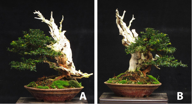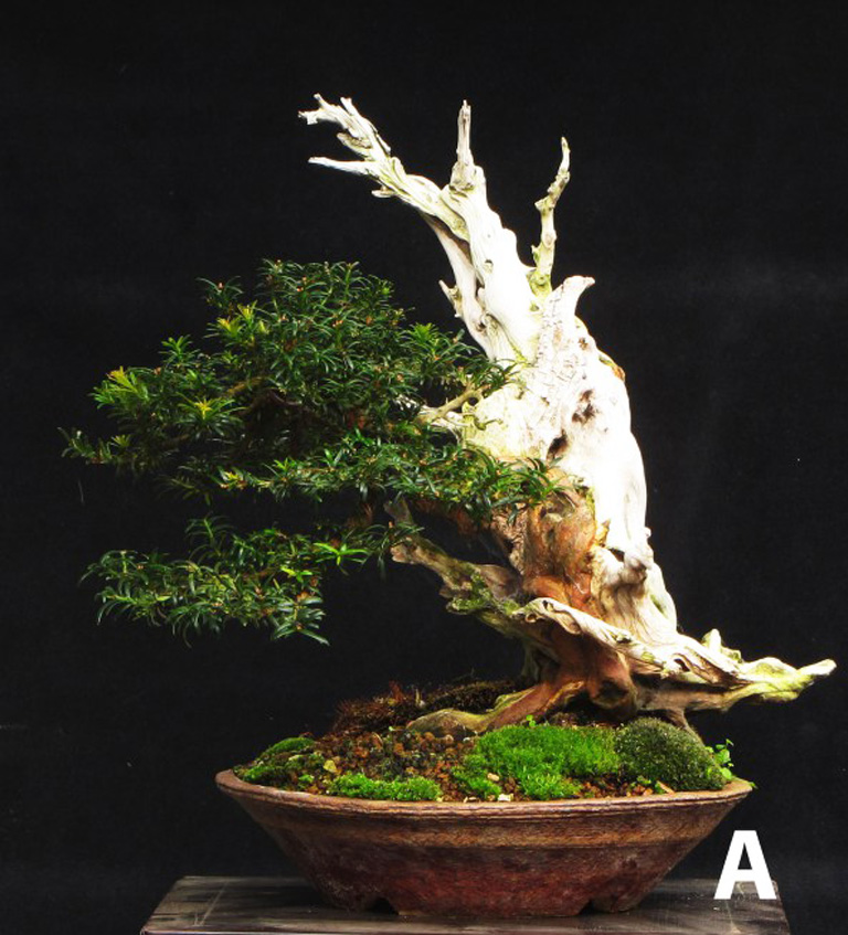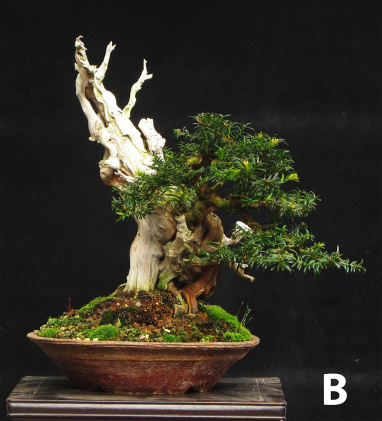
These two views of the same tree and the question posed (below) are from Tony Tickle’s website.
The tree shown here belongs to Tony Tickle. It’s a Yew (the species isn’t mentioned, but I’m guessing English). You can find it on Tony’s Bonsai & Yamadori site under the heading Please choose your favorite ‘Front’ for this Yew.
If you visit Bonsai & Yamadori you can vote for your favorite front (aka best view), and, if you’re really ambitious, you can explain yourself in the comments (you can do the same in our comments below).
Meanwhile, I’ll keep my opinion to myself. Except to say it’s a dilemma we’d all like to have.


Here is an update: It’s almost a year since these photos were made and a decision has been taken and the tree worked accordingly, here is the tree this month: http://yamadori.co.uk/#jp-carousel-4334
I think Tony’s got his designs dialed-in. When we create a bonsai with a distinct “front”, we limit ourselves in how we can compose a well-arranged, harmonious display. As bonsai itself is an art operating in all four dimensions (height, width, depth, and time), my personal belief is that we should always strive for a universally appealing bonsai, regardless of left/right orientation. There are some designs (cascades and similar) that do not lend themselves to a 360deg appeal, but should look equally good when rotated through 180deg with the cascading branch facing you.
That, to me, is the ultimate challenge when designing a tree. To achieve it, we may be required to graft and hard decisions on where to expose the trunk to achieve the image we ultimately desire. Not every tree has the capability to be developed to this degree. We need to be more selective in our material, develop a more refined eye, and most of all, discuss our designs with other artists who may see something we don’t. Bonsai is not an art designed to be created in a vacuum, but instead to be shared with others who contribute to our vision, encourage us to be bold, and most of all to gain more enjoyment and camaraderie from our fellow artists.
I think that the B front is the best one. The tree and the pot go together very nicely and the position is right, suggesting a certain instability and possible future disaster. If it were my tree I would carve out the knothole in the front a little more to indicate more age. This tree reminds me of the bristlecone pines that live near me. It tells a story of centuries of storms, struggle and endurance. Wonderful.
Even though this may be an old photo, I feel that A is the best front because the dead wood and the live tree feel to be more in harmony because they are moving in the same direction. Photo B shows the dead wood and the living tree to be moving in opposing directions. Just feelings…….
Thanks Tony,
Looks like you’ve made your choice. Great tree even though I was all side B.
Thanks Thom, Dave and all (and of course Tony)
Just took another look and I’m still leaning B. Mostly because the live trunk and branches are more visible and the design is a little more compact and coherent to my eye. This is not to say I don’t like A, because I do. It seems a little more outrageous (in the positive sense) with more tension set up by the movement in opposite directions.