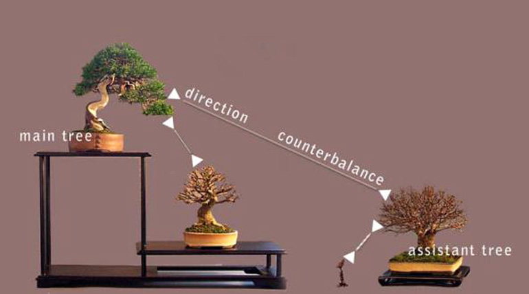
Morten Albek’s virtual restructing of Hans Vleugels’ Shohin display (the text and arrows are very helpful, though it would have been great to see a second version without them… but we’ll take what we can get). This photo and the three just below are from British Shohin Bonsai.
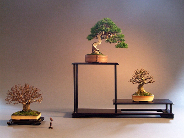
Here’s a piece of the text from British Shohin Bonsai: “The display was created as part of a photo session at Hans’ bonsai club Eda Uchi Kai where members were asked to bring some trees for a professional photo shoot by Jan Dieryck. The trees in the shohin display are a Juniperus chinensis, an Acer buergerianum, and a Zelkova serrata. Hans’ request for possible improvements brought out several responses, mostly in favour of the existing display but also with minor suggestions such as moving the Juniper slightly off-centre on the rack. But the most enlightening response came from Morten Albek…” (you can visit BSB for the rest of the story).
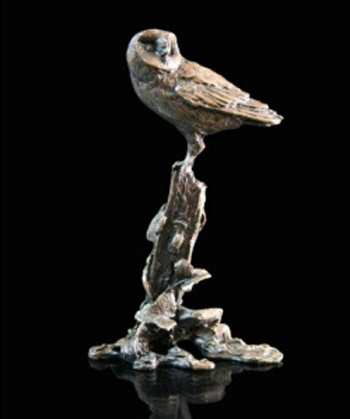
The owl is difficult to make out in the photos above.
 British Shohin Bonsai’s masthead photo.

The masthead from Morten Albek’s Shohin Bonsai Europe website.
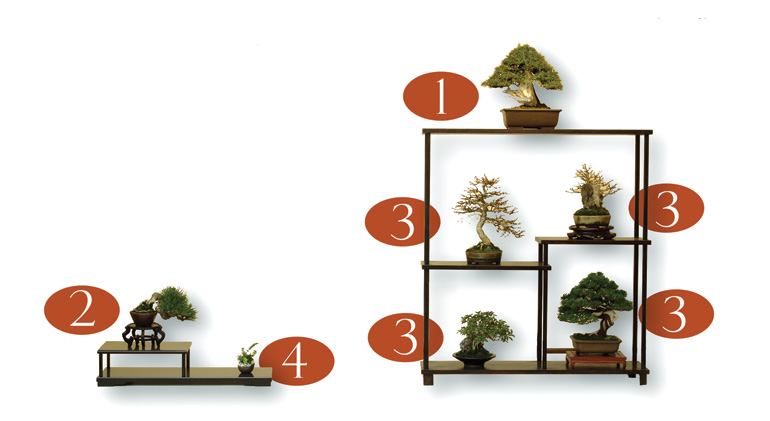
This self explanatory display photo by Morten Albek was one of hundreds of photos that Morten submitted with his Majesty in Miniature Shohin Bonsai book that didn’t make it into the book (if you ask the editor/publisher why, he’ll say that the market just wasn’t ready for a six thousand page book).
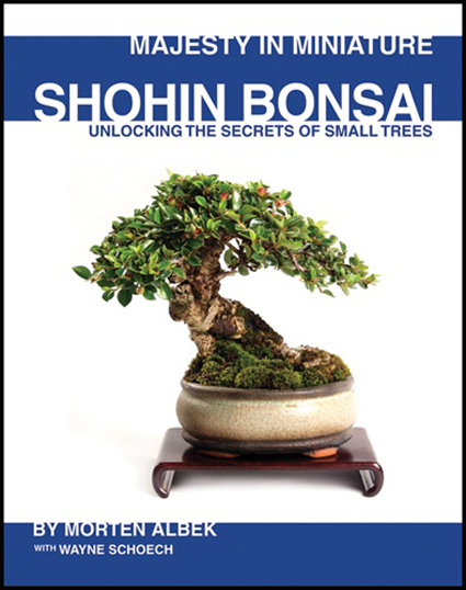
The cover of Morten’s excellent Shohin book. Currently on Sale at Stone Lantern.
With all due respect to Morten Albek, whose reasoning I am sure was impeccable, I didn’t find his altered layout of Hans Vleugels’ Shohin display to be an aesthetic improvement at all. The question to myself was “why not” – an interesting exercise, thanks to Bonsai Bark for the opportunity.
My feeling is that Albek’s placement of the three trees using the original display shelves comes out quite linear and two-dimensional, furthermore requires the eye to slam-dunk right at the center of the display field when the natural instinct is for visual line and attending emotional feeling to rise. The original Shohin display is graceful, open, without jarring visual stops or compressions, and offers the unique presence of each tree equally in a way I feel the Albek arrangement does not. Both satisfy the “triangle” infrastructure requirement, but rules alone don’t make something beautiful. Maybe it’s a girl thing ….
I like Hans’ display better. Morten’s display is too flat.
Thanks Kristin,
It’s always gratifying when someone takes the time and trouble for an in-depth comment like yours. But I’m not buying the girl thing… more like a paying attention and applying intelligence thing (maybe that is a girl thing? hopefully a boy thing too).
I think one of the reasons Morten’s appears a little flat might have to do with it being virtual. I suspect if he were actually creating the display in real space, more depth would be the result. But I guess we would have to ask him (Morten, you out there?). We could also ask him about the rest of your observations.
Jim, looks like you agree with Kristin.
Thank you for your comments. My point was, in a clear and simple illustration, to show how the direction of trees gives a better balance in the display. It looks flat in the virtual of course, but that is the nature of making a point without having the trees and other tables in flesh, arranging them in the computer without the light and shadows (my skills doesn’t go further).
I hope my point is still taken as it was intended, an educational virtual of the balance of a display shown graphically. It is always better in real life.
You don’t have to agree. We all see things differently. As a final comment, I can add that Hans actually did like my suggestion better than the first display.