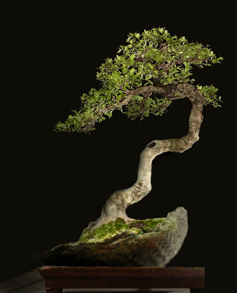
Robert Steven’s simulation of a Ficus that was submitted by Yessi Ariesta (see before photo below).
It has been a while since we’ve featured a Robert Steven critique and now, out of the blue, we’re blessed with two.
The first tree is somewhat dramatic as are Robert’s changes. The second tree is much simpler and that simplicity is carried over with more subtle changes.
For years now Robert Steven has been remarkably generous with his free critiques (the word free should be emphasized; what other world renowned bonsai artist and teacher offers something like this?). So why not take advantage of Robert’s generosity and submit a photo of one (or more) of your bonsai?
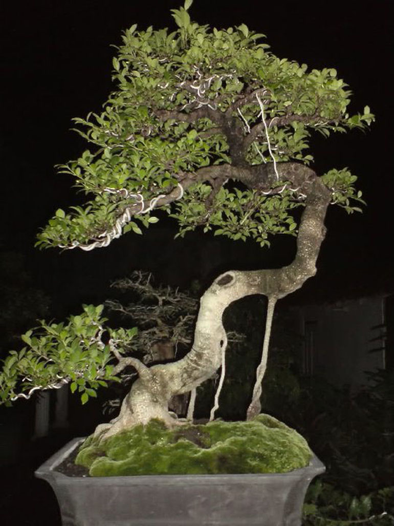
Before. The photo that was submitted for critique by Yessi Ariesta.
Robert’s Critique of Yessi Ariesta’s Ficus
Too much is too much
Looking at the line of the trunk’s movement, it is quite clear that this bonsai fits the literati style. One of the basic characters of literati bonsai is simplicity.
The aerial roots and the lower branch disturb the view of the flowing trunk line. On the upper part of the trunk, there are two competing lines, one to the left and one going up to the apex. This creates an unpleasant tension at the top of the tree. Last but not least, the foliage at the top is too heavy and the shape and size of the pot is too massive and masculine when compared with the feminine character of the tree (continued below).
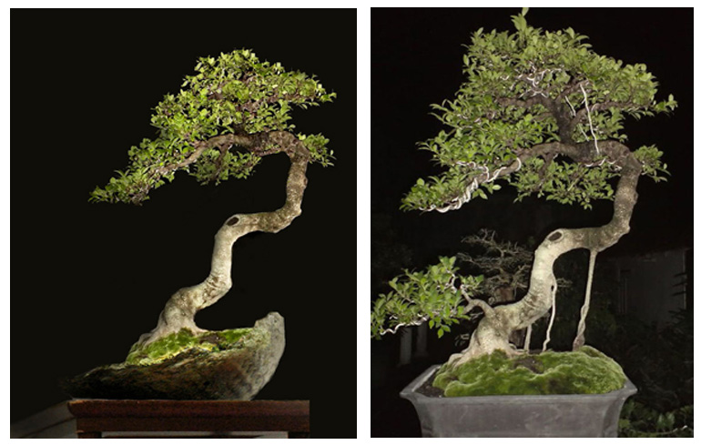
Robert’s simulation is on the left in this image.
The solution is to chop off the lower branch and the aerial roots, and thin down the foliage at the top; and then cover the upward flowing line with foliage in order to create a clear continuous line that releases the trunk’s flow to the left.
Finally, the new container with its natural shape creates a counter balance and enhances the shape of the tree; a shape that suggests a tree growing on sloping land.
Critique #2
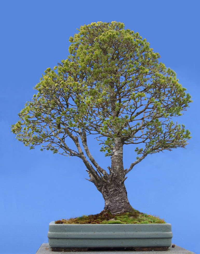
Robert Steven’s simulation of a Spruce that was submitted by Ann Mudie.
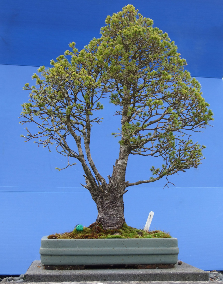
Before. The photo that was submitted for critique by Ann Mudie.
Robert’s Critique of Ann Mudie’s Spruce
I’m not sure if Picea* will bud back, so I will not suggest an extreme design solution. Instead, we’ll provide a simple solution on how to improve a bonsai composition using aesthetic principles.
In any art form, design is all about composition harmony. Focal point and visual balance are among the most important design principles. A good flow will create good visual balance.
In this regard there are a few issues with this bonsai. The focal point and visual balance are created by a bad view of the tree’s flow; it seems to have three trunks, so it’s positioned as a formal multiple trunk with the straight upright trunk’s base planted at the center of the pot (continued below).
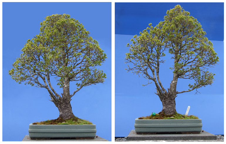
Robert’s simulation is on the left in this image.
In fact, the two small ‘trunks’ are branches rather than trunks (they are too small compare to the main trunk to be considered trunks). Consequently the composition is not well balanced. The upper part of the tree drives the flow to the right, but there is no counter balance on the left. The gap is too open, the main trunk seems to separate from the left side, so the focal point is biased from the overall composition. Overall there are many contradicting movements.
My solution is very simple. I repositioned the tree by moving it to the right and then tilting it to the left so that the main trunk slants slightly to the left. By this simple repositioning, the main trunk’s role as the focal point is much better, and the leftward flow is clearer.
The rest of the job is just refining the ramification (branching) and foliage. The small branch on the right is bent slightly upright to fit the others (or it could be cut off).
*Picea is the Spruce genus. In this case it looks like a Picea glauca ‘Conica’, a North American tree commonly called Dwarf Alberta spruce (ed.).
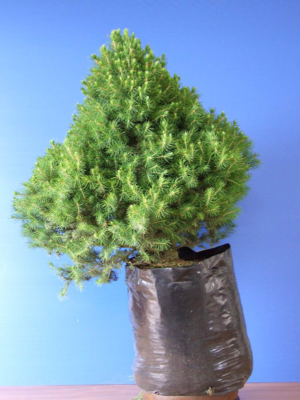
Before before.
Robert’s general comments
There is more than one way to design any bonsai and my critiques and recommended solutions might not always fit your taste and personal preferences, but I always try to give my opinion based on artistic and horticultural principles.
To understand my concepts better, please read my books Vision of My Soul and Mission of Transformation which is available at Stone Lantern.