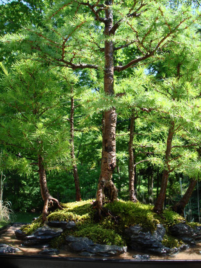
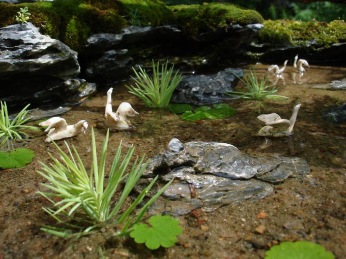
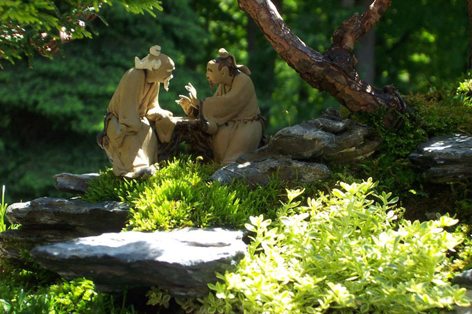
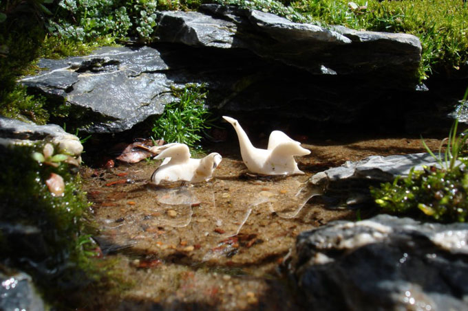
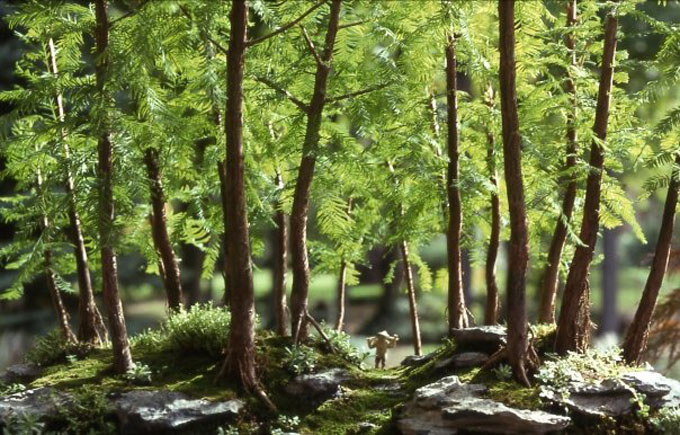
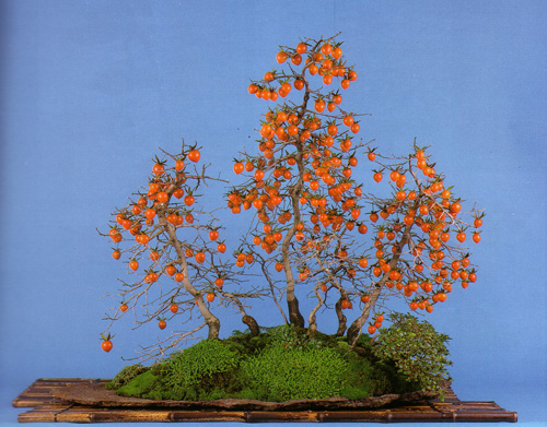
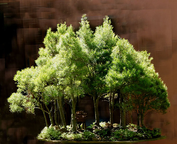
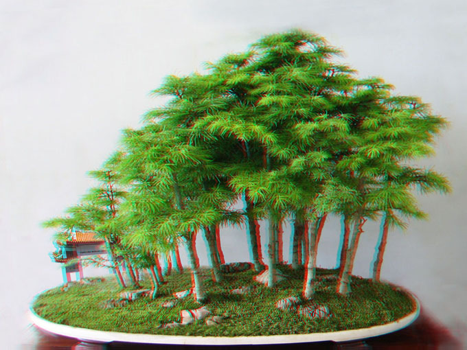
 Robert Steven’s simulation of a forest planting that was submitted by Paulo Netto (photo immediately below). Here’s some of what Robert has to say about this simulation: “The irregular placement of the trees creates a better perspective and the impact of the focal point is more obvious. Sufficient empty space makes the scenery much more interesting and natural.”
A good place to start
Forest planting are fun and easy. Easy in the sense that anyone can gather a group of small trees and place them in a pot. Often, even complete novices will find the results pleasing, especially if they have very little idea of all that goes into making a truly natural looking and beautiful forest planting.
A deeper understanding
Soon enough though, if our novices stick with bonsai, they’ll begin to realize just how clumsy and unnatural their early attempts are (in most cases, at least). This is where education and the potential for a deeper understanding begins.
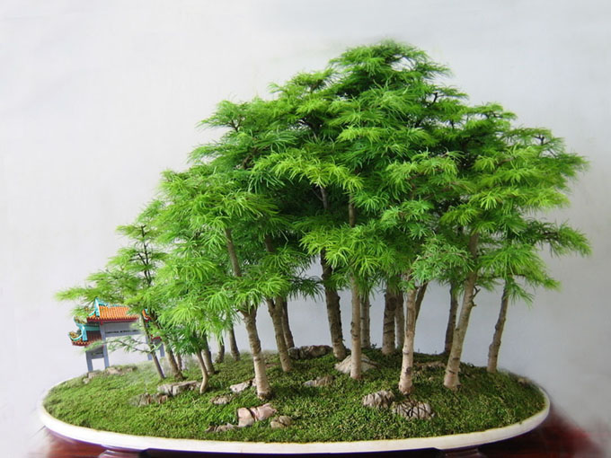
 Paulo Netto submitted this photo for Robert to critique.
Robert’s Critique
The original as submitted
The materials used in the creation of this planting are ideal for creating a long distant forest view, considering their sizes, structural features and the number available.
The original design seems to be alright, though somewhat boring. This lack of interest is due to several conceptual issues.
In forest style bonsai, focal point is one of the main components of composition. In a long distance view where most of the trees are a similar size, the focal point is not only created by the tallest tree, but can also be emphasized by placing several trees close together to form a dominant group.
In this design, there is one tallest tree in the middle, but it is not dominant enough to suggest a strong focal point.
The overly symmetrical composition where most of the trees are placed more or less the same distance apart, lacks a sense depth which also contributes to the design’s somewhat boring appearance. The tray is also too small which results in a lack of empty space and resulting panoramic effect.
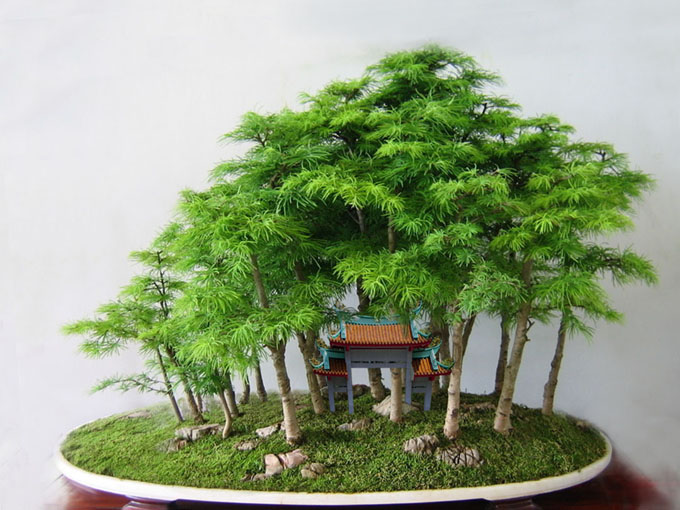
Last but not least, the most disturbing issue is the Chinese gate ornament placed among the trees. In addition to not working well with the theme of the planting, the scale is not correct. It simply does not correlate with or enhance the plantings overall perspective. Nor is its scale correct for the individual trees.
First simulation
The photo at the top of the page is an example of similar materials designed in an asymmetrical composition. The irregular placement of the trees creates a better perspective and the impact of the focal point is more obvious. Sufficient empty space makes the scenery much more interesting and natural.
Two more simulations
In the following simulations, I also experimented with different positions for the Chinese gate ornament.
 In this simulation, I put the gate in the very back of the pot. The way that it is placed suggests that it’s quite a ways off in the back. This plays a role in drawing out the background into the distance, which in addition to creating a panoramic effect, tends to make the trees seem taller.
 But when I put the same ornament in front or among the trees like Paulo’s original design, then it creates a totally different effect. Now it looks more like a small toy among the trees than a large Chinese gate. It does not have the scaling effect of making the trees look taller, unless you imagine a group of super tall trees with giant leaves, which is not a very convincing scene.
 You can view this picture in 3D image by using red-cyan 3D glasses
General comments
There is more than one way to design any bonsai and my critiques and recommended solutions might not always fit your taste and personal preferences, but I always try to give my opinion based on artistic and horticultural principles.
To understand my concepts better, please read my books Vision of My Soul and Mission of Transformation which are available at Stone Lantern.
My bonsai blog address : http://robert-steven.ofbonsai.org
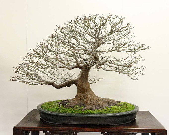 This Shishigashira Japanese maple was a 2012 Kokufu award winner. A few things stand out about this remarkable tree: the shape, with most of the action on one side is somewhat unusual for a Japanese maple; the wonderful nebari with its smooth spread and the way it stabilizes the top of the tree; and the undulating movement of the branching (from primary branches all the way out to the tips of the twigs).
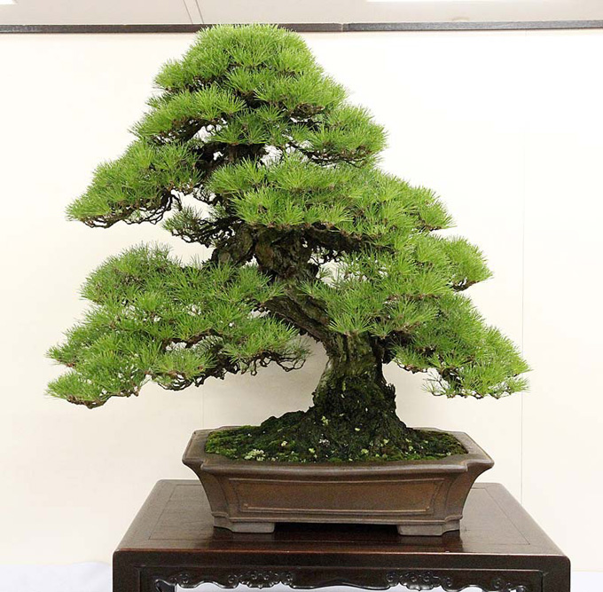 This ancient looking Japanese black pine was another award winner.
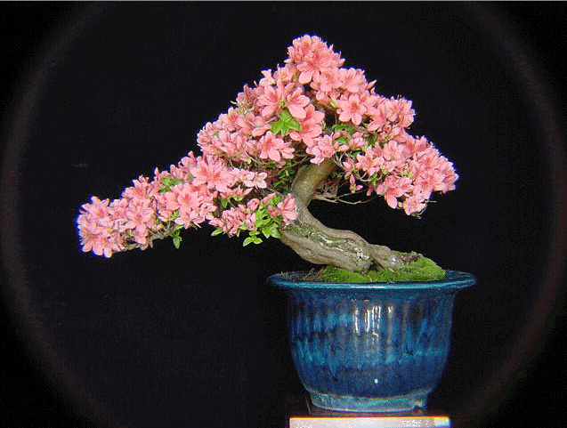
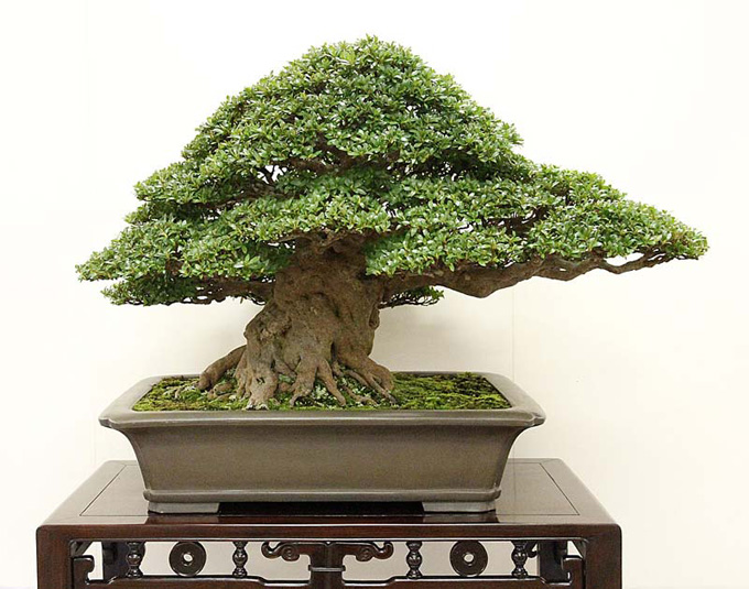 This massive and massively impressive Satsuki azalea was also a Kokufu award winner.
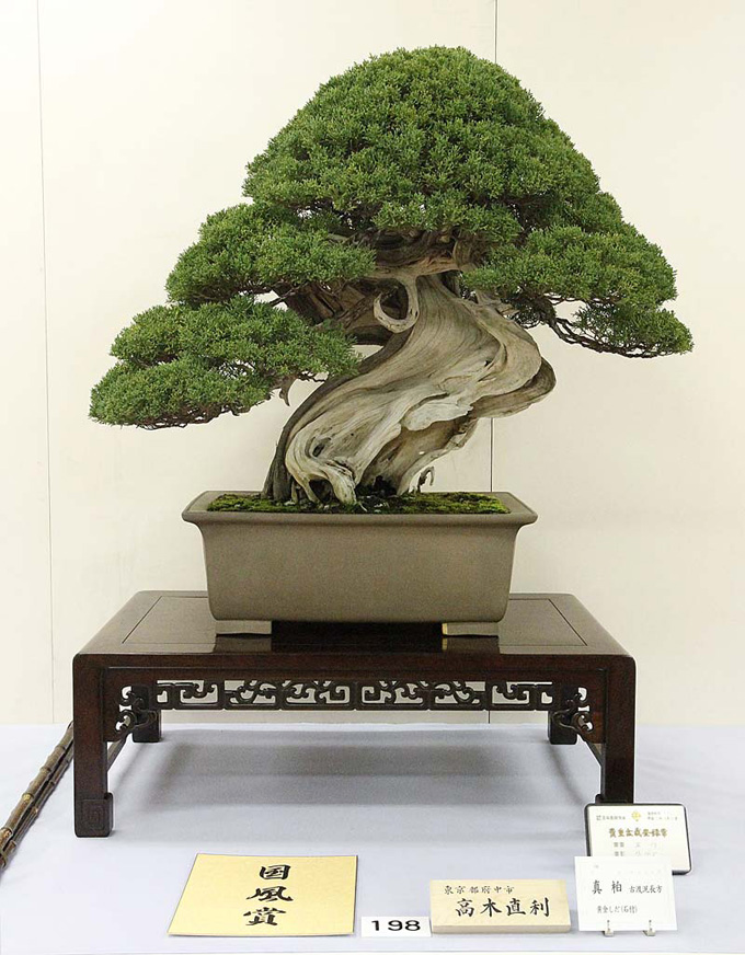 I like the little hook at the top of trunk on this award winning Shimpaku juniper.
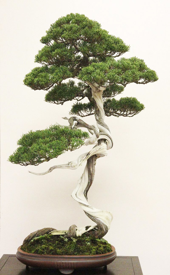 Bill’s favorite. No award for this bunjin Shimpaku, but perhaps the most unique of all the tree’s in Bill’s post. Especially given the action along the top of soil.
  Sign up now and we’ll see you there!