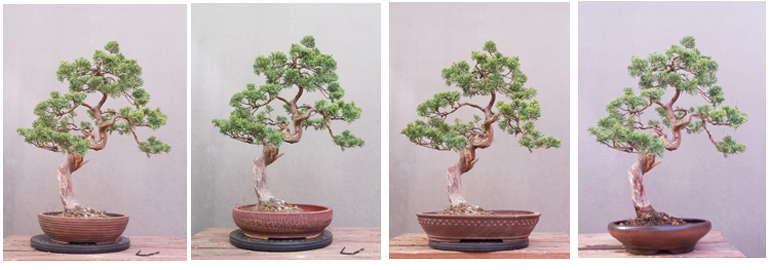
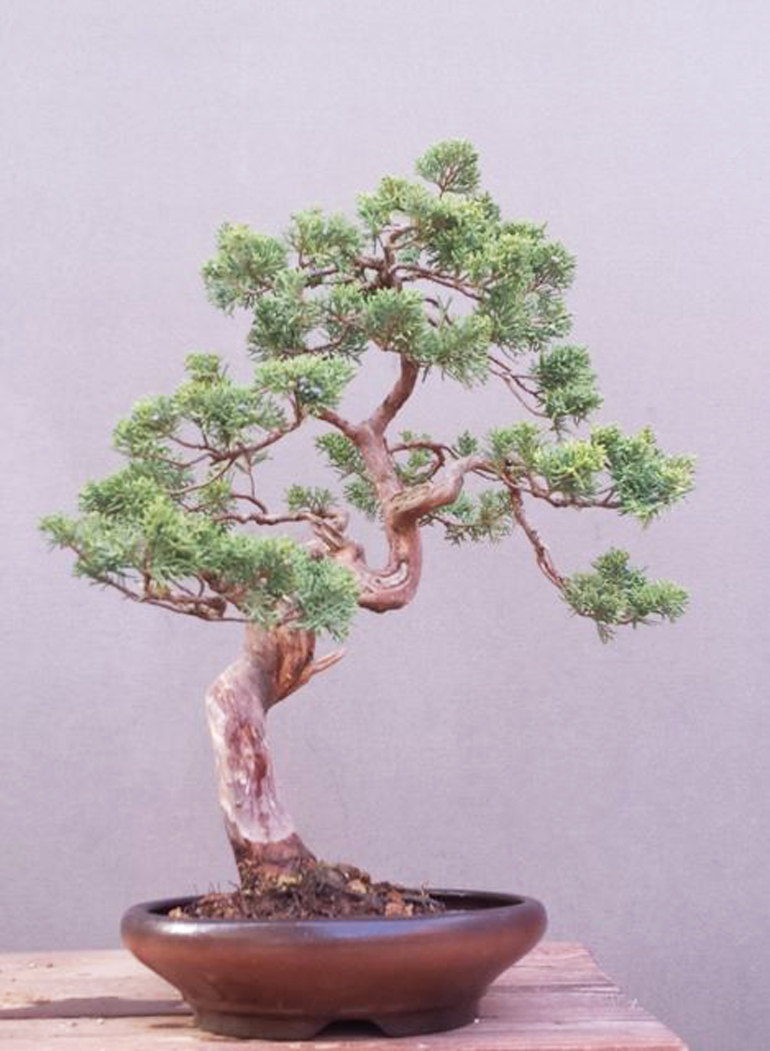
These four images were borrowed from Juraj Szabó on facebook. Juraj lives, works and plays in Slovakia. The tree is a Shimpaku juniper (Juniperus chinensis sargentii). Juraj doesn't say where the pots came from, though a couple look like they might be either Tokoname or Yixing pots.
Most of our previous Which Pot? posts have been lifted from Boon Manakitivipart, so it was nice to discover one from someone (and somewhere) else. Nothing against Boon’s offerings, he puts on a world class facebook bonsai show, just a nice change of pace.
A couple details:
First, it’s best if you put your choices (and explanations) in the comments. Please don’t email me. I’m struggling to keep up with my 50,000 daily emails as is.
Second, I encourage you to visit Juraj Szabó on facebook and comment there as well. He’s the one who did the real work and, as you know, everyone on facebook loves comments and likes.
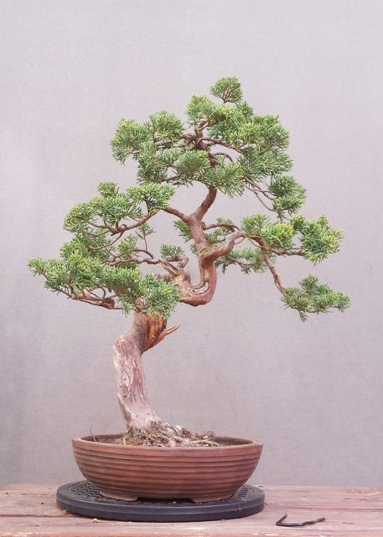
Pot #1
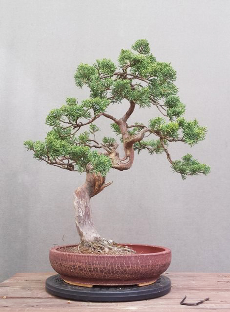
Pot #2
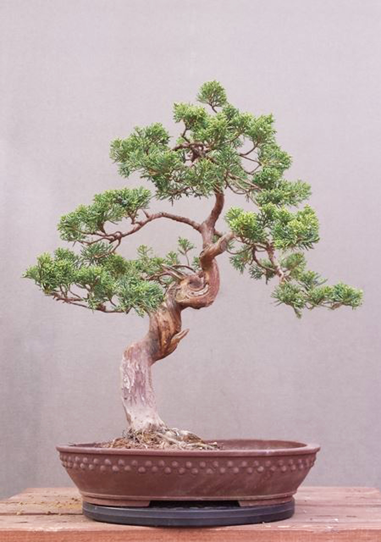
Pot #3
Pot #4
I like number one. Dimensions are right for the tree. Color is nice with the trunk and bark, and the horizontal pattern of the pot settles comfortably under the tree which is not a knockout and won’t stand a very important looking pot. Number two pot’s crackle finish overpowers the tree. Pot three is too large. Pot four has a patina that doesn’t compliment the tree in any fashion.
I prefer pot number 3 because the rectangular decoration appears to complement the rough twisting trunk.
I can appreciate Doug’s comment regarding Pot #4, but I still like the curved lines and footing of this pot. It also seems to open up the negative space on the right, providing nice balance.
We wonder about all round pots and so deep? We don’t prefer any and would pot this in a shallower tray or ellipse. All of these rounds seem under potted length and width (except 3) and over potted for depth.
I like 4 because of the lean the tree has in that placement and thought that the contrast of the shiny pot really drew my eye in
I would chose #4.
Very feminine tree with nice curves. A contrasting feminine pot shows off the tree.
When I look at the other 3 all I see is the Pot, not the tree.
Paul
I really prefer the third pot. It gives the tree a feeling of strength, of balance especially that I don’t feel in the other pots.
I like pot #4.
This juniper will eventually have its bark cleaned and oiled and the shiny pot will work beautifully with the bark. Both tree and pot give a feminine, sensuous feeling.
My second choice is #1 due to its size and shape. If the glazing was different, it might have taken the top spot. The glazing in #2 is too busy and won’t go well with oiled bark. #3 is just too big.
#4 for me as well. The shape with the pot is more graceful than the other three, and more specifically compliments the lines of the trunk in the lower 1/3 of the tree, as well as the deeply curved lip emphasizing the curves of the trunk line above — nice transition and echo ;) Color is very good; smooth finish also simpler and less distracting than the surface details of #s 1-3. This pot makes the tree look better.
#4 is the only one that’s remotely close to what this tree needs.
Has to be #4. It’s a little deep but color works with the live vein as does the smoothness of the pot.
I like number four the best because the tree, rather than the pot, should be the focal point. Number 4 does not distract the eye from the tree. I like number one the second best because the lines in the pot are picked up by the lines in the trunk and branches of the tree, thereby integrating the pot with the tree more than the others.
Gotta agree with Doug’s points. Number 1 is proportioned right and shows off tree best. 4 could be considered but patina does not work.
I prefer #4 for its size, shape and color. The others are either too big or have a finish that does not compliment the tree as much as #4.